Summary: Everybody’s using data to improve their business and internal operations. So should you
“What do you want to measure?”
That’s the question I asked my friend during a conversation last week. She is running project management at an entertainment company in New York City, and she’s starting research into potential project management systems. Leadership has made it clear that analytics and metrics are important to them.
What should she try to measure?
Well, if it were me, I’d start at the top — is leadership just interested in time and money, or something more? Then I’d layer on my own wish list for data analysis about the workflow and the team. I would add all these needs to my Requirements Doc and start scouting for a system.
That’s what I’d do, if I had a clean slate.
But life is often more complicated — sometimes you’ve got to play the hand you’re dealt. This was the scenario when I came into my current role at AT&T. A task management system was already running much of the company’s digital workflow, crossing over many teams. The creative group had recently joined on, but the job ticket wasn’t very friendly for their needs.
Modernizing the job ticket was a project that lasted several months. But once the configuration was complete and the new ticketing system adopted by the group, work began flowing and data came pouring out. Some beautiful patterns emerged.
What’s Behind This Obsession with Data, Anyway?
Here’s an easy assignment: Do a web search for “data-driven decision making”. It’s a hot topic, right? And for good reason. Gut instinct isn’t enough for companies to remain competitive. The collection and analysis of data leads businesses to insights about their products, customers, and competitive landscape. Data also helps them look inward to find ways to improve or optimize operations. There are many related approaches, including Six Sigma and kaizen.
When it comes to Creative Operations — here on the business side of Creative and Marketing teams and organizations — data is super-crucial for continuous improvement.
How might data help creative teams do a better job?
- Identifying bottlenecks
- Bandwidth & capacity tracking
- Time tracking
- Cost management
- Scheduling and planning
Last year my friend Carrie Roberts helped roll out a new workflow management tool for her employer Johnson & Johnson. As manager of global talent operations, Carrie needed to harvest some “people” data pertaining to staffing and talent consistent with the data-driven nature of the company.
She’s measuring everything but the kitchen sink, especially anything relating to time and money:
- Hours — actual vs estimated
- Hours — billable vs non-billable
- Cost — actual vs estimated
- Utilization — where the team is putting their time (by project or sector)
Says Carrie: “We’re taking complex data and information and trying to present that in an understandable, creative-friendly way. We identify trends and start to ask questions that help leadership make informed decisions.” She lets the data tell the story, and it’s a powerful approach.
At AT&T, I benchmarked and reported on two KPI’s: (1) Total number of projects; and (2) our Backlog of jobs-accepted-but-not-started. These measures track our volume of work and the health of our pipeline.
With two stats I could measure the health of our pipeline: Total number of jobs, and of those jobs how many were waiting for work to begin.
Total Projects:
Total Projects is highly variable depending on many many factors. For example, our active projects can easily spike by 30% leading up to a product launch (such as Apple announcing their new iPhones), or for one of the company’s quarterly initiatives. (Total projects are normally in the 90-140 range.)
Backlog:
Our Backlog is the jobs that are in the queue pending design to start. Projects sometimes linger in in Pending-vs-Active status when there’s too much work and not enough designers (a classic supply-and-demand imbalance), or when something gets placed on hold due to an incomplete brief or is frozen for some business reason. (Pending projects are normally in the 20-30% range.)
Backlog tells me about the health of our pipeline — but it’s a lagging indicator. For example, if new jobs spike one week, it takes several days for the backlog to rise. The opposite is also true. Once we deliver everything for a tentpole quarterly offer, it takes a couple of weeks for our backlog to simmer down and start trending south toward the mean.
Together, Total Jobs and the Pending/Active ratio help me red-flag trouble spots and predict when my team will start to feel the strain. Stress shows up in missed deadlines, poor communications, and slippage in quality. This is normal and human, but as a manager I need to help mitigate these issues and keep up the high standards that our partners and stakeholders rightly expect.
But what about my report?
Raw data just makes peoples’ eyes glaze over. This is where charts and graphs come in. I developed a visualization format to help tell my story. I also add some analysis and observations as a sidebar:
- Highlights from last week
- Intake vs capacity
- How many projects are over with our partner agency?
- Staffing forecast, looming bottlenecks, etc.
- Conclusions — trends up or down? Any red flags?
Two examples:
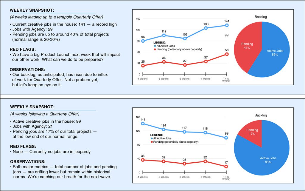
My conclusions avoid being prescriptive. I’m really not telling anyone what to do — I want the data to do most of the talking.
The goal is to help colleagues and teammates to use data for capacity planning, triage, or even if just to push back if all our “clients” happen to show up at once with their rush jobs. It’s a conversation starter that helps us chart a course around the daily challenges and obstacles that we face together.
Bottom Line: Data is your friend. Configure your Project or Task Management tool to capture good data — then visualize it in persuasive a way to tell your story and enable your partners and leaders to make better decisions. If your leadership isn’t asking for data, you should be giving it to them anyway. There are lots of tools to help do this.